
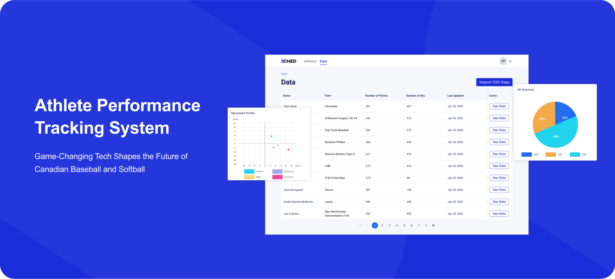
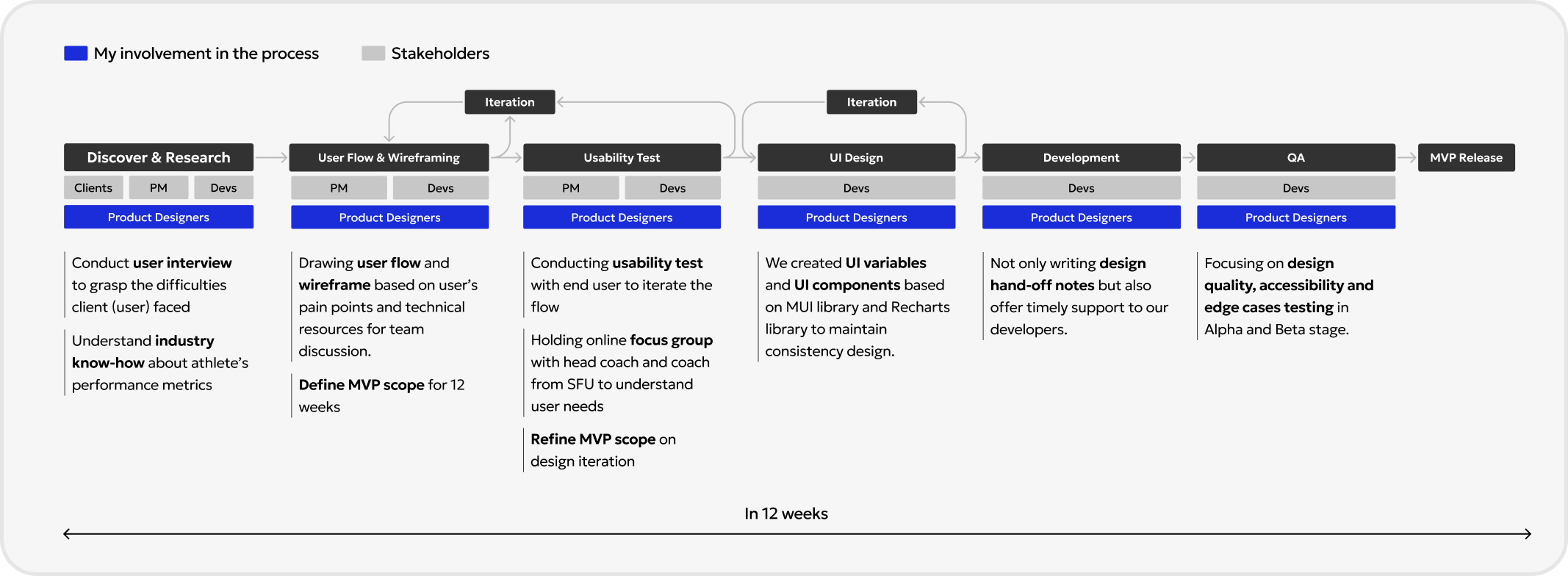
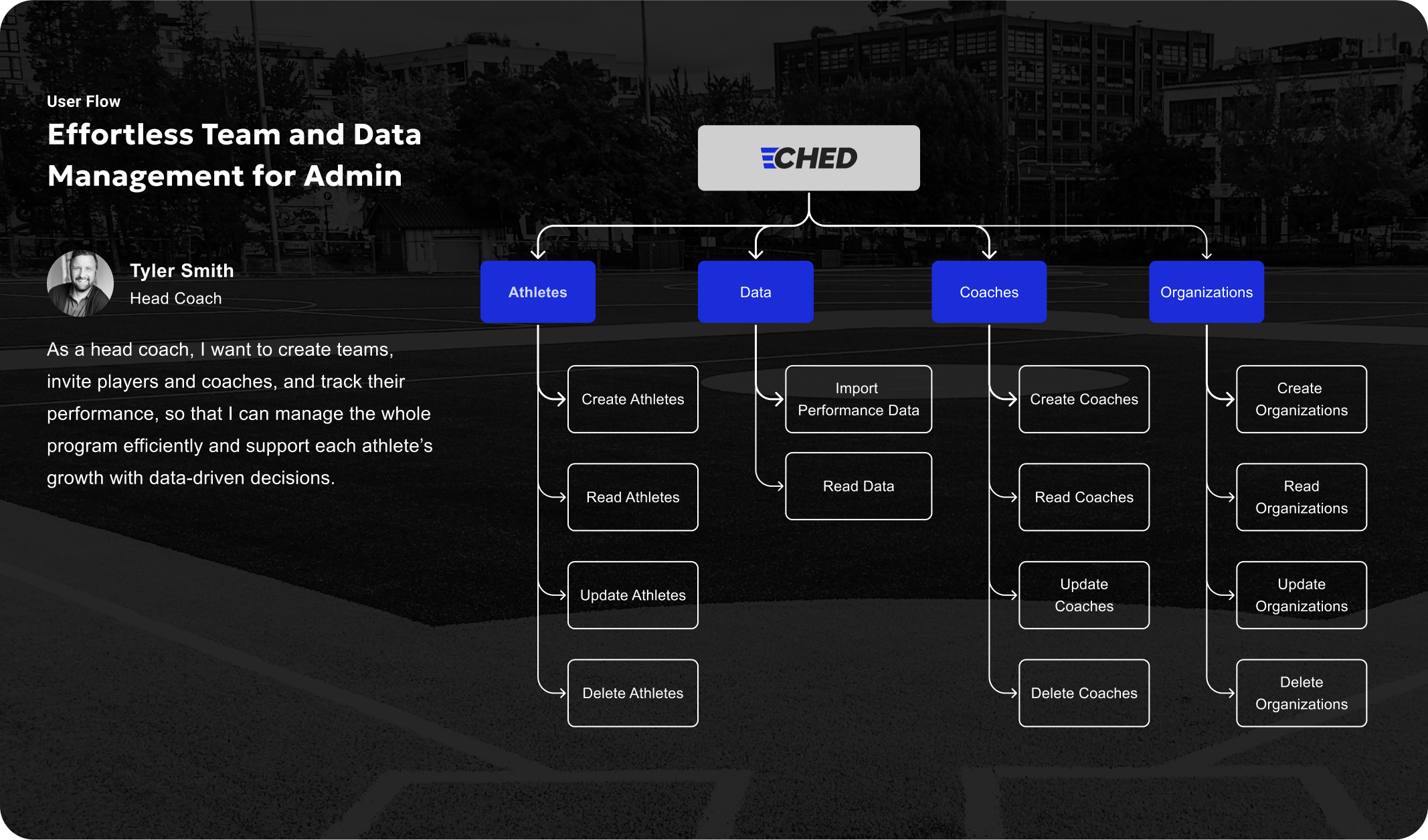
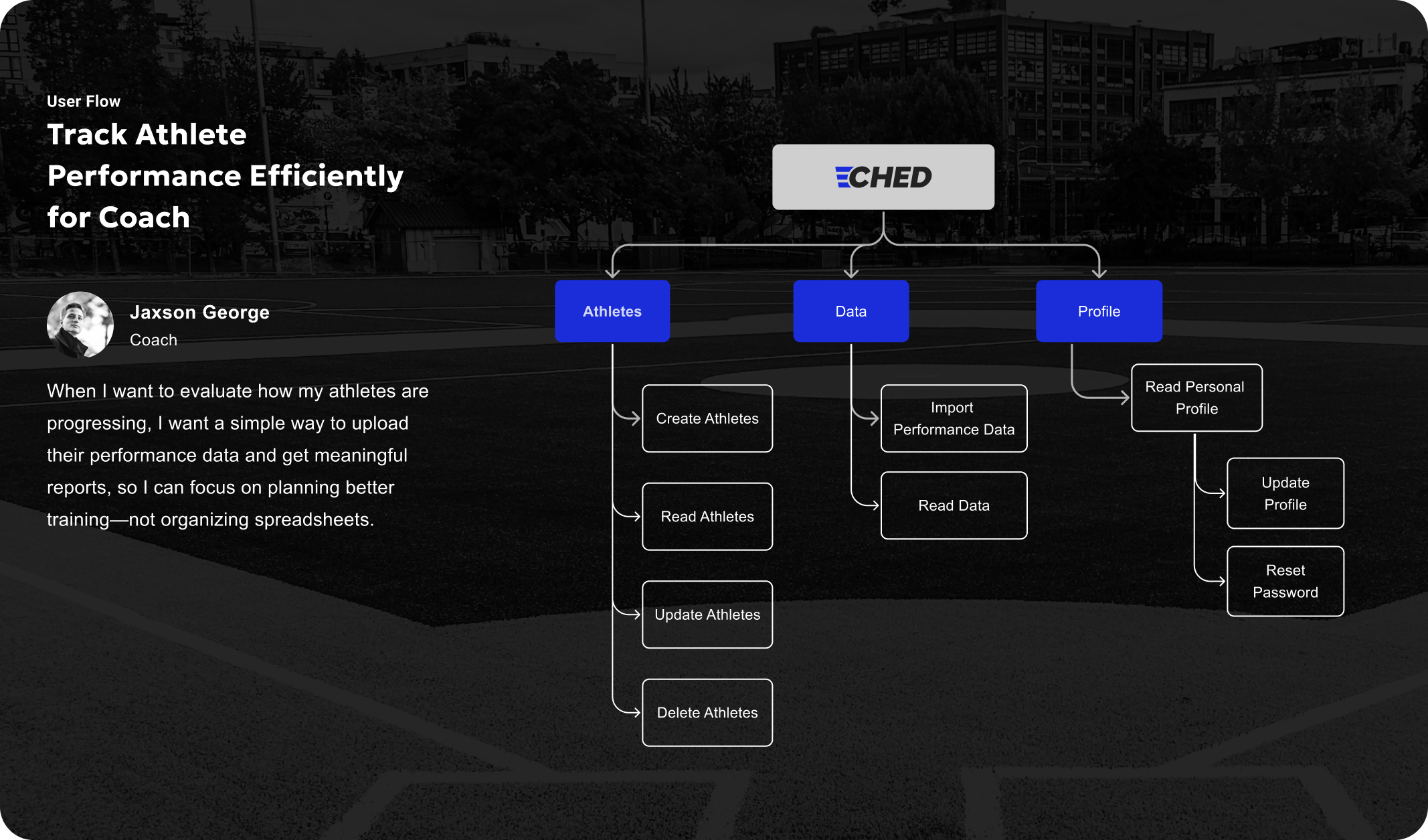
CHED is a web application that helps coaches from youth baseball and softball teams manage athletes' performance data efficiently.
In MLB and other top professional leagues, teams usually have a complete Data Science Team.
They can collect data from different devices and integrate the information into their own internal analysis platforms. This helps them build systems for player performance tracking, technical improvement, and health management. However, for the youth baseball and softball, most teams do not have these resources.
Even if they are willing to adopt new technology, they usually can only afford a few devices. Even with these devices, the data is often scattered across different apps and systems, and doesn not connect with each other.
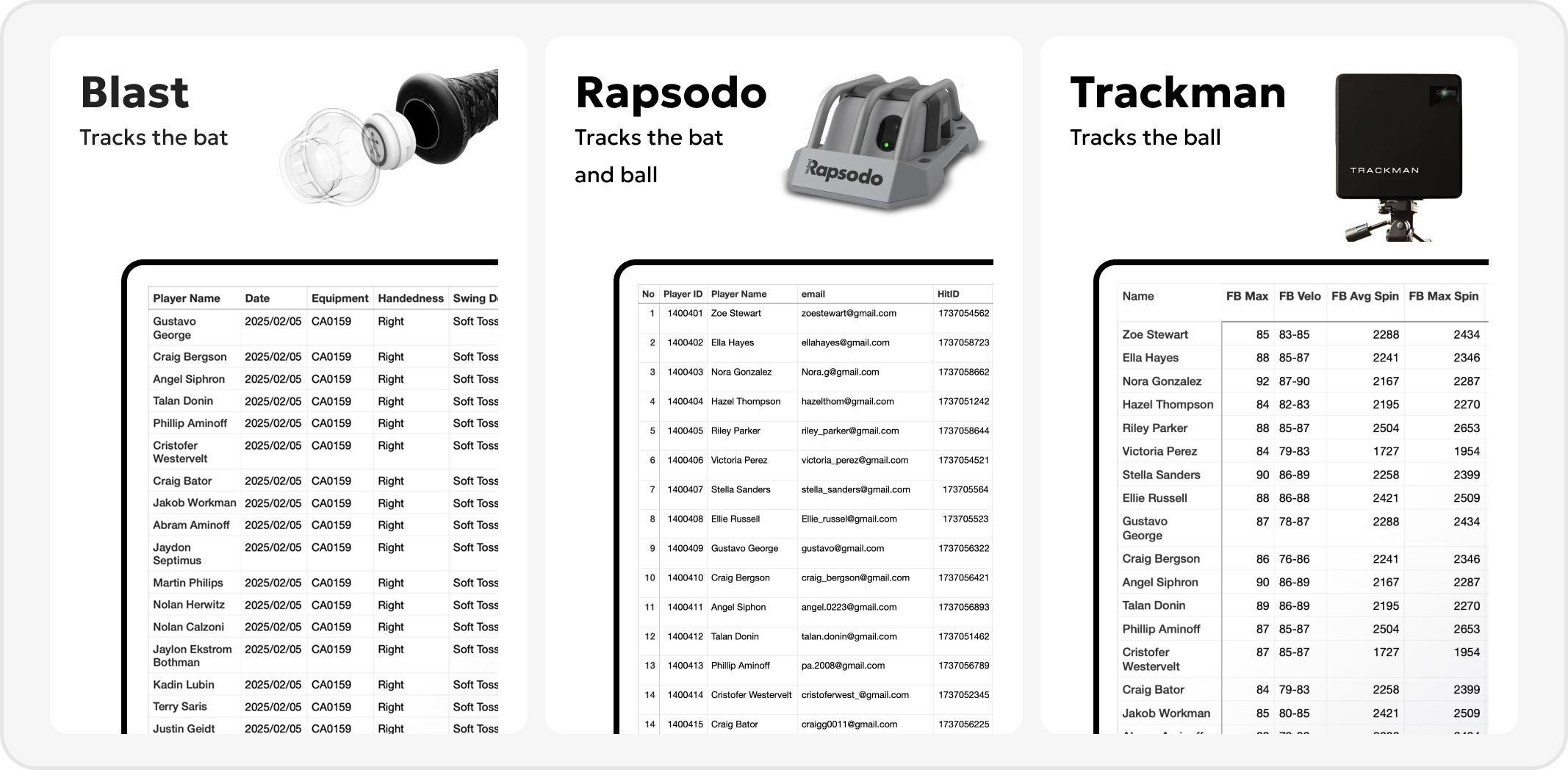
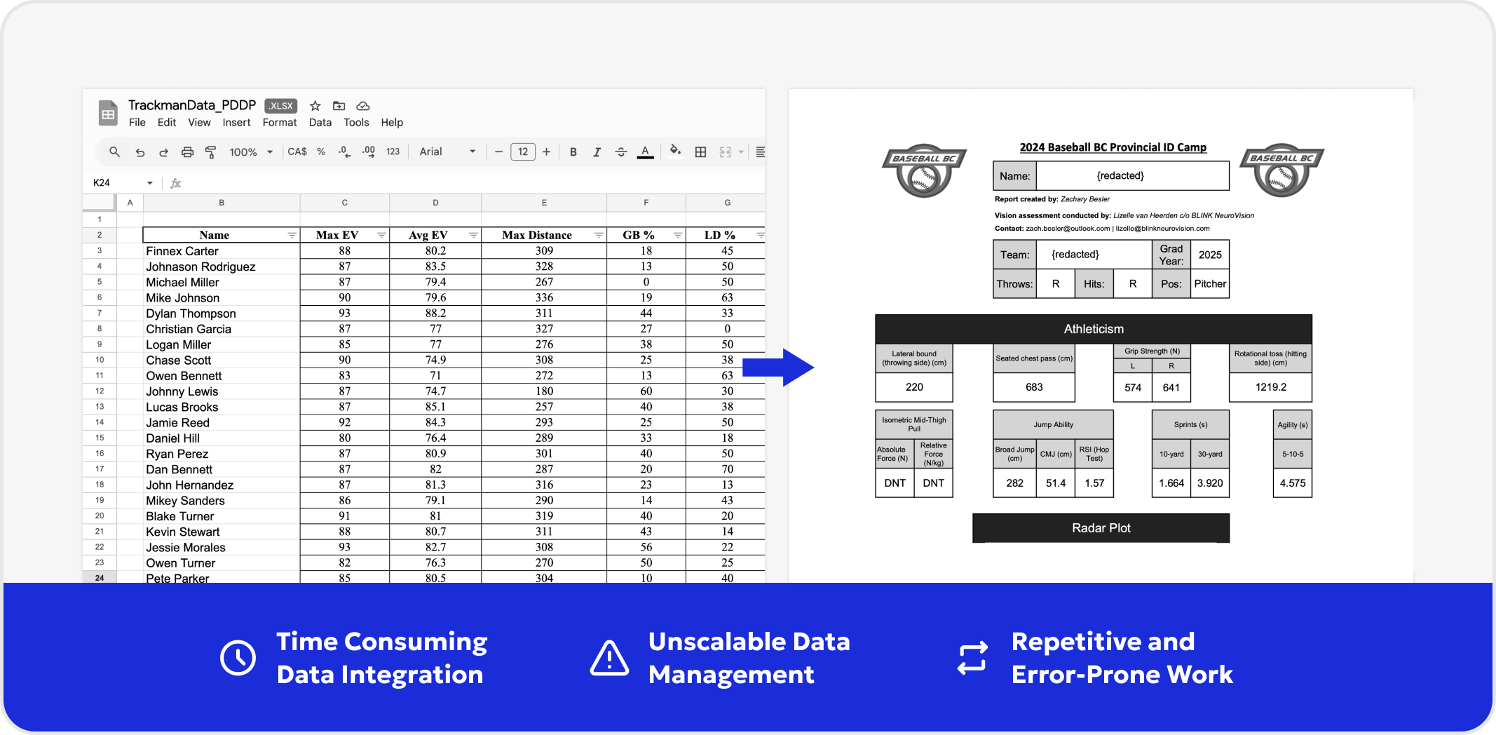
Our project originates from a university coach who spends large amount of time manually collecting data from various performance tracking devices, such as Rapsodo, Blast Motion, and TrackMan. Since these devices operate independently, the coach has to manually integrate the data into Excel, which is time-consuming.
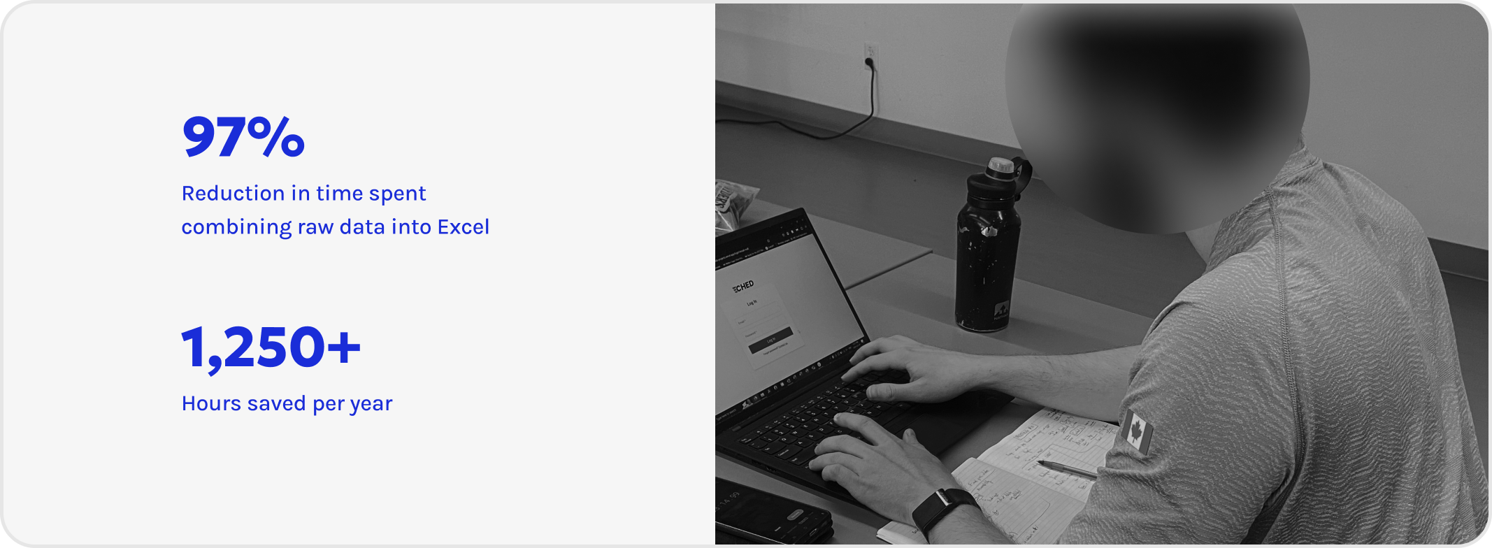
Before implementing the new system, our user spent more than 25 hours per week combining raw data, creating the final reports and send to each athlete one by one via email. With the system, the process now takes less than an hour per team. This resulted in a 97% reduction in the time spent , 1250+ hours saved per year.
Challenge: At the start, our lead developer was hesitant to implement several core features, as they were unsure about the product's feasibility and preferred to start with a very minimal scope. However, this wouldn’t solve our users’ real problems.
What I Did: I suggested to run usability tests with our initial wireframes, and invited the development team to observe live. When they saw how users struggled, it helped everyone understand why those features were important. This helped shift the mindset from “build what’s easy” to “build what’s needed,” making design-dev communication much smoother moving forward.
Challenge: As a design lead I have to make decisions quickly so the team could keep moving.I’m someone who likes to take time to think things through, weigh different options, and explore possibilities. But in a team setting, waiting too long can block progress. People needed direction immediately.
What I Did : This role pushed me to get more comfortable making decisions based on the information available at the moment. It also trained me to start thinking through potential scenarios earlier in the process, so that when a decision point came, I’d already considered the trade-offs.
I learned that being a lead isn’t about always having the perfect answer, and it’s about creating clarity so others can keep moving forward instead.Over time, I found a balance: making thoughtful decisions quickly when needed, while also looping back later to reflect and adjust if necessary.
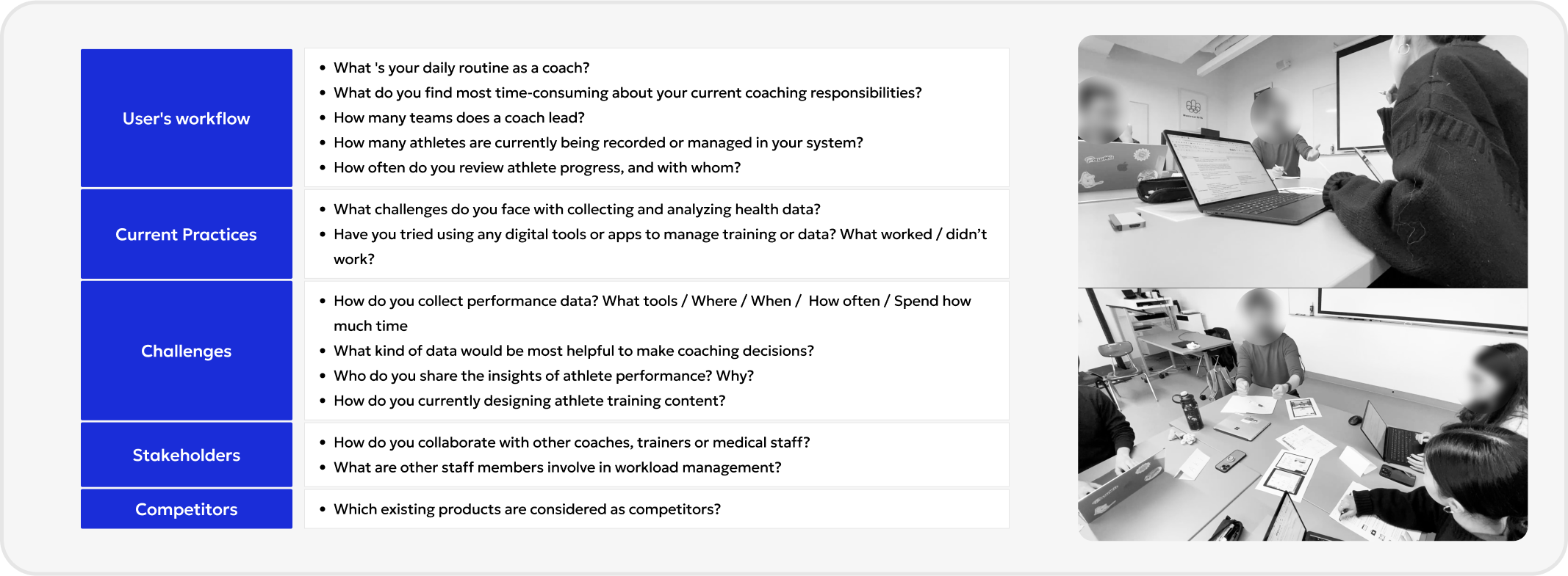
We conducted semi-structure interview with 2 coaches and 1 head coach to understand their workflow, challenges and opportunity.
We identified one major friction point: performance data management is highly manual. Coaches must download CSV files from multiple devices (Blast, Rapsodo, Trackman), manually compile them into Excel, generate final reports on their own, and email them individually to each athlete. This repetitive process takes up to 25 hours per week. As a result, this leads to several key challenges:
1. Process inefficiencies: Over 25 hours per week are spent on repetitive data handling tasks.
2. Lack of scalability: This manual workflow cannot be scaled across larger teams or multiple coaching staff.
3. High risk of human error: Relying heavily on manual file handling and data consolidation increases the chances of mistakes—such as misaligned data, sending reports to the wrong athlete, or incorrect performance summaries.
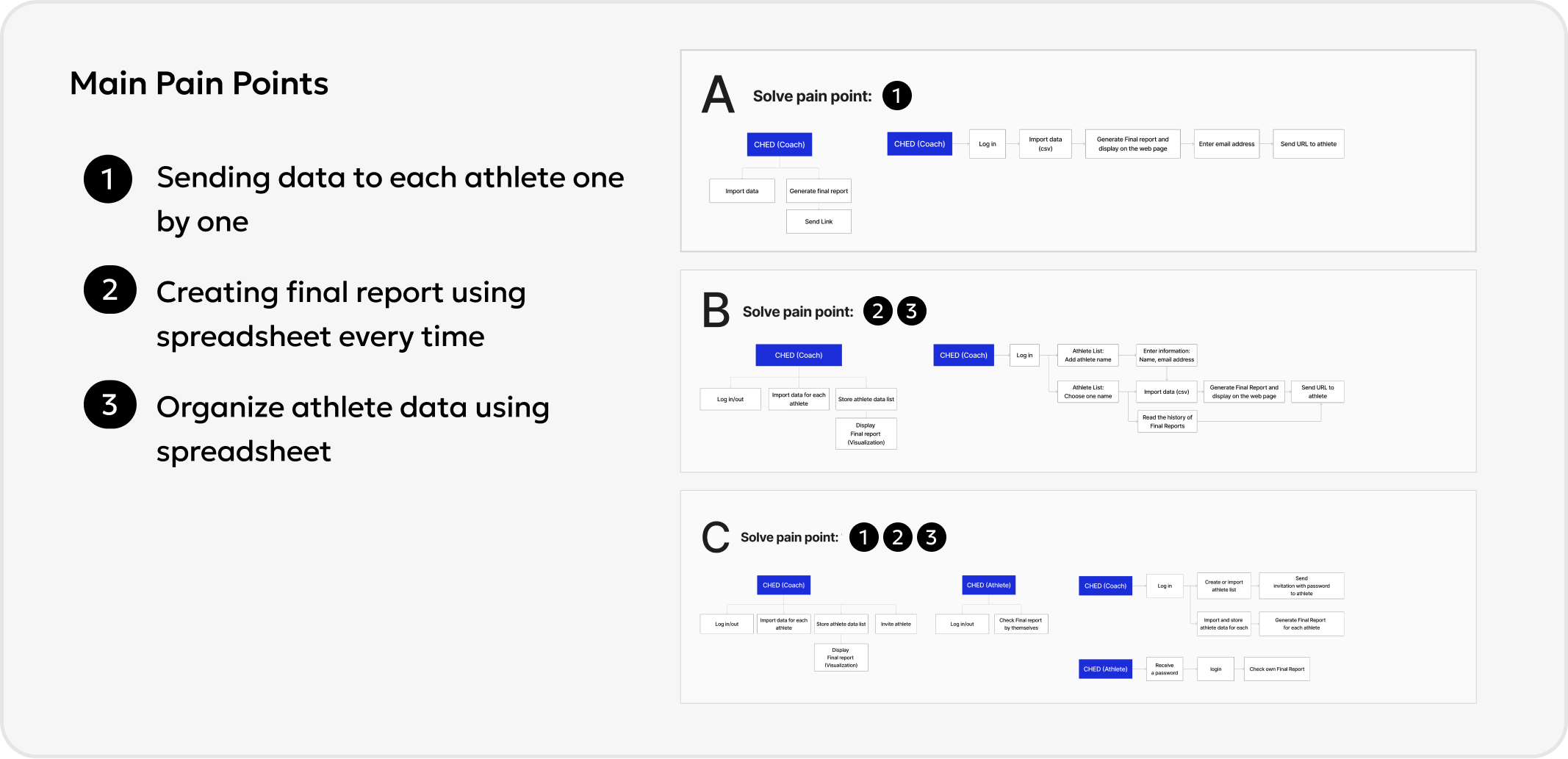
We identified three main user pain points:
- Sending data to each athlete one by one
- Creating final reports manually using spreadsheets
- Managing athlete data in spreadsheets
To address these, we mapped out three potential user flows (A, B, and C) and discussed possible solutions as a team. Given our limited development resources, we carefully considered different flows with technical feasibility and scalability in mind. Each flow explores how we might resolve one or more pain points while staying within our current capabilities.
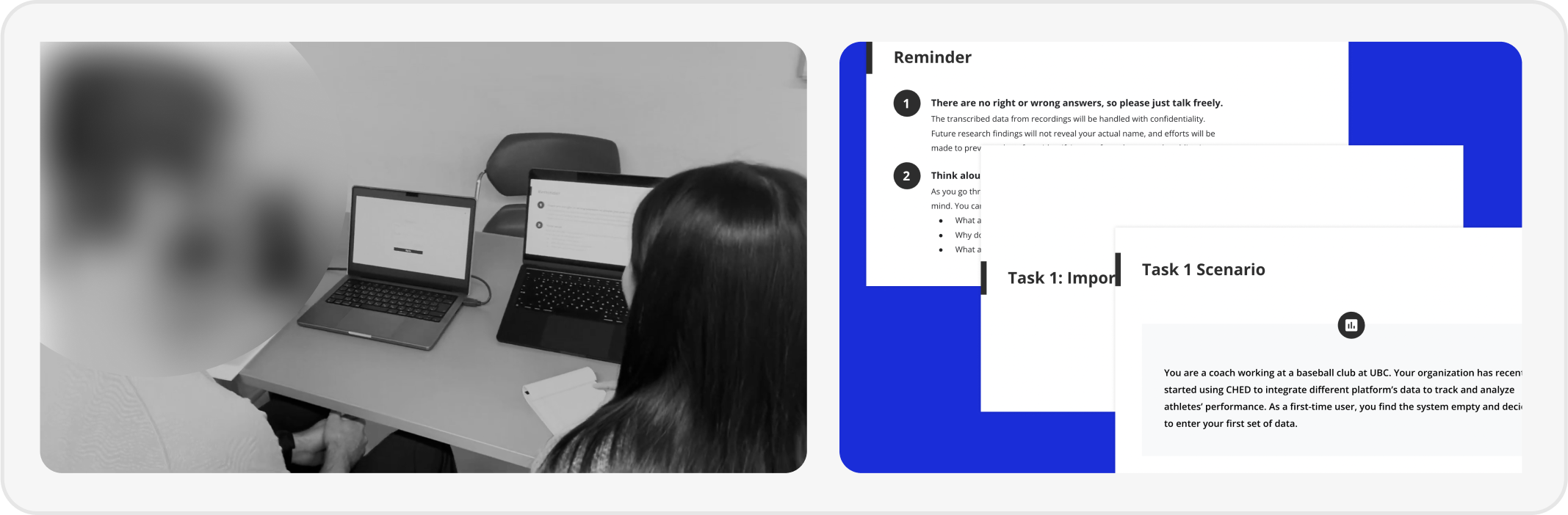
After creating a clickable prototype, we conducted an user testing with 5 participants to get feedbacks and continue iterating product. We aimed to evaluate whether the following three design elements align with users’ intuition during their first-time experience with the system:
1. Whether users can quickly identify the system structure (know which function under which menu)
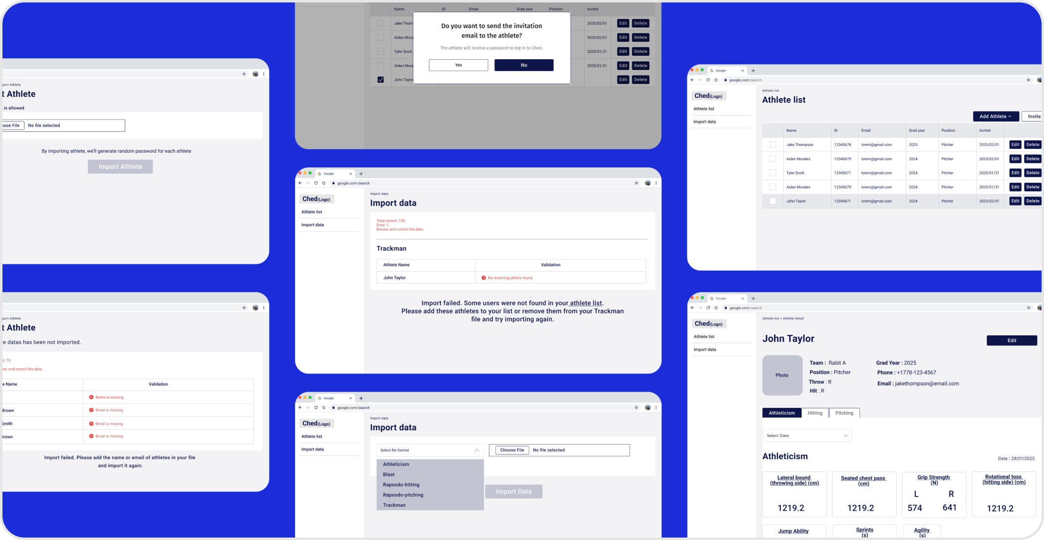
2. Whether the guidance are clear for user to know the next move when importing data has issues
3. Whether users can quickly navigate to detail page to read the final report
The test outcomes is significant and insightful. We’ve learned 16 key takeaways, including 3 validated, 6 concerns, and 7 opportunities.
During usability testing, we mapped out each screen the user interacted with and captured their reactions step by step.Whenever users encountered confusion or blockers, we color-coded the screens based on severity. It helped us prioritize which screens and components to redesign first.
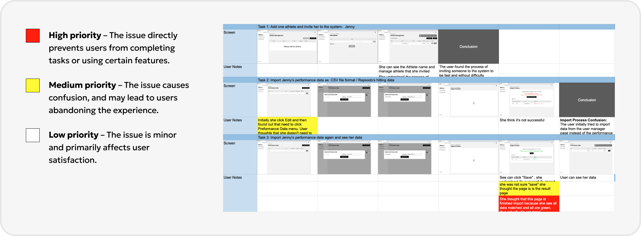
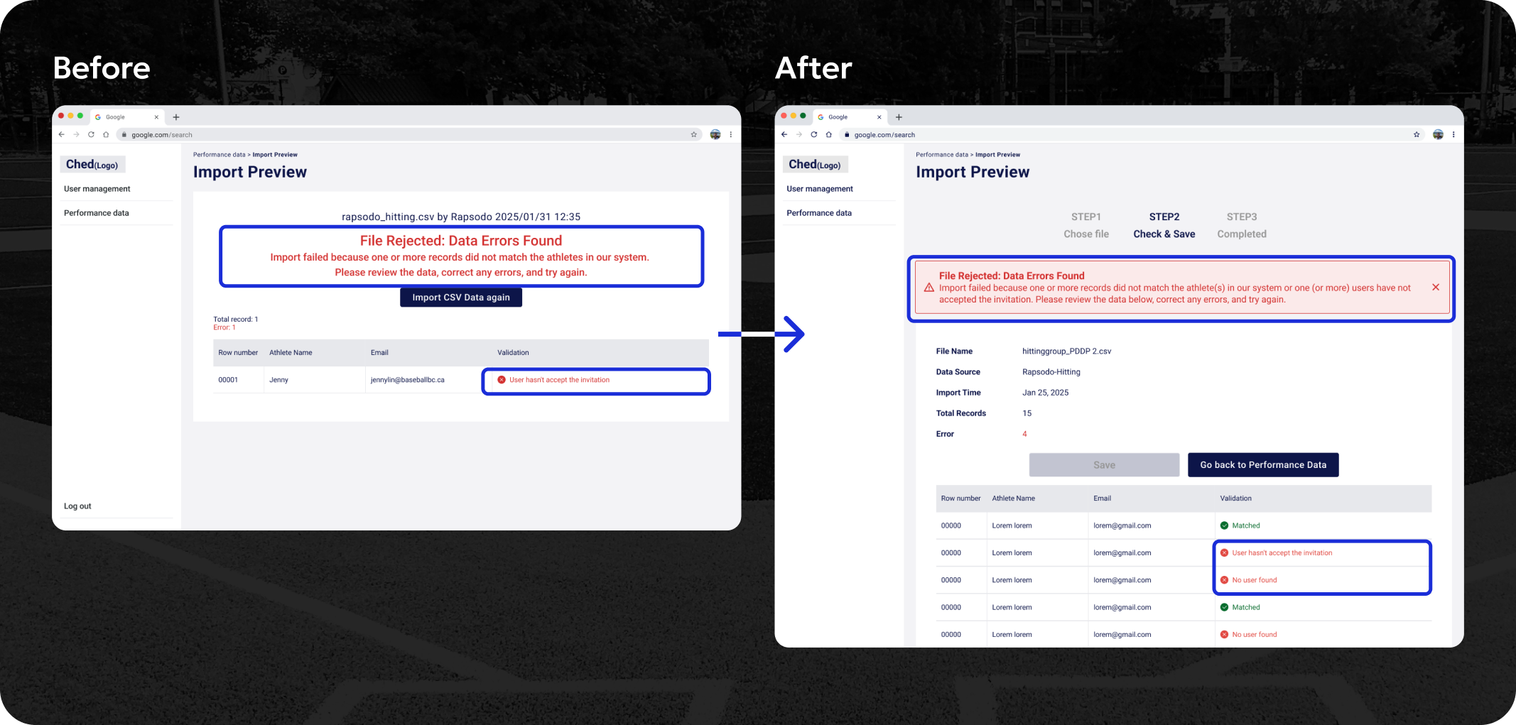
Problem 1 - Misleading Visual Hierarchy
Solution 1 - Reorganize the visual hierarchy of error message
During internal testing, some participants mistakenly thought the red text was the complete explanation and overlooked critical information. We assume the reason is behind is because the large red error message (“File Rejected”) dominated the screen, drawing attention away from the row-level validation details below.
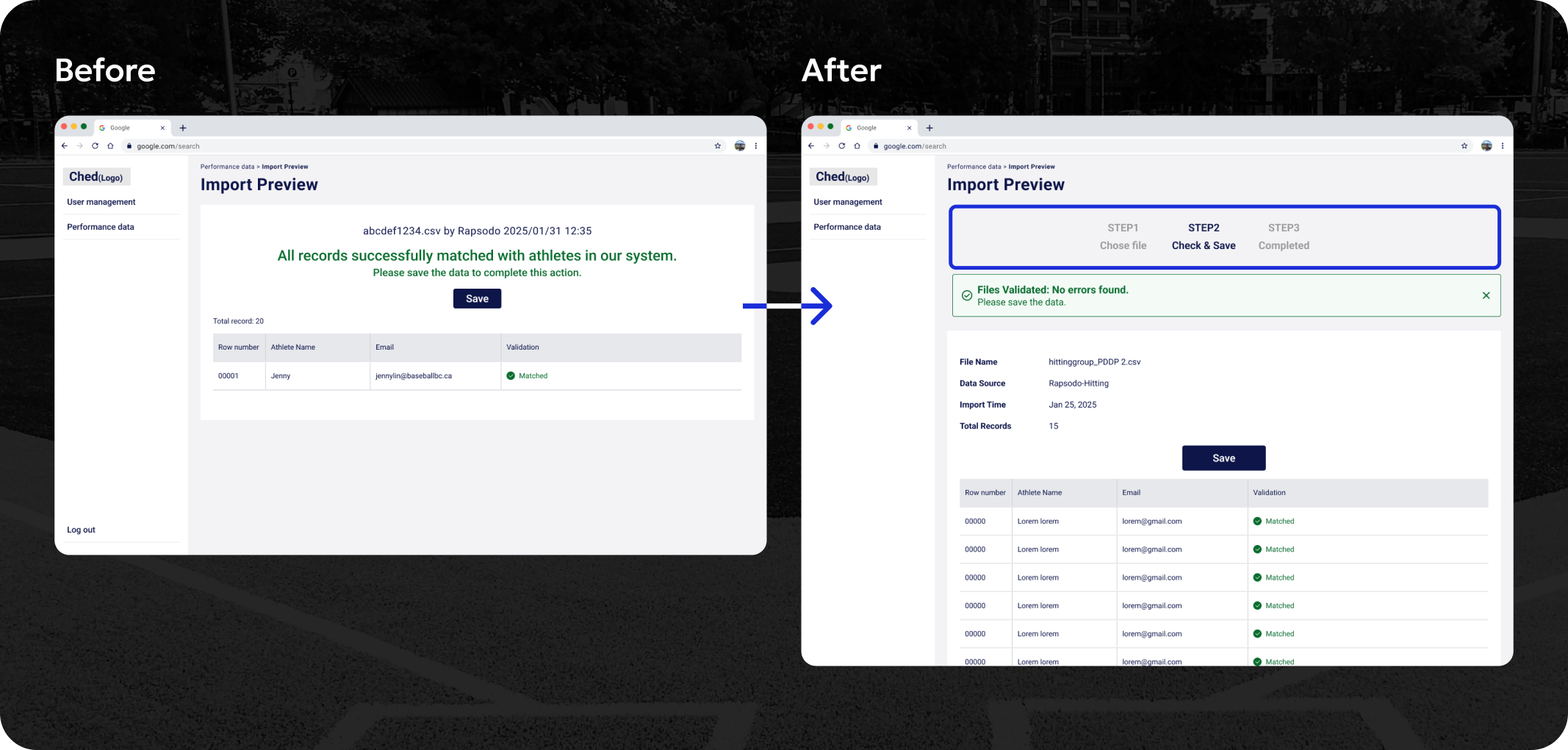
Problem 2 - Misleading Visual Confirmation
Solution 2 - Adding Steps to Make Progress Visible
When users saw the green “Matched” indicators in the table, they assumed the import process was already complete and successful. As a result, some users tried to leave the screen immediately, without realizing they still needed to click “Save” to confirm the import.
To address this, we introduced a 3-step progress indicator at the top of the screen. It also helped users understand that confirming the data (by clicking “Save”) was required before moving on.
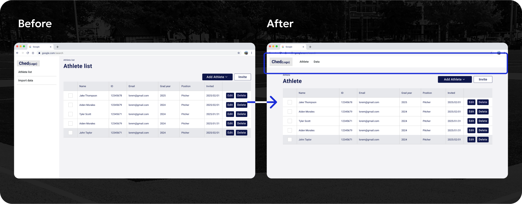
Problem - Limited Table Space Due to Sidebar Layout
Solution - Top Navigation Frees Up Table Space
In the early stages of the project, the client mentioned that the product would likely expand to include many new features. To support this potential growth, we initially chose a sidebar navigation layout that could scale and accommodate multiple sections.However, as the project progressed, the client later confirmed that the feature set would remain limited in the near term.
This opened up an opportunity to simplify the layout and optimize screen space for the core experience. The sidebar layout used up space on the left, which reduced the space available for the data table.This was especially challenging for pages like the athlete list, where many columns need to be shown clearly.
So we moved the main navigation to a horizontal header bar. This free up more horizontal space for wide tables.
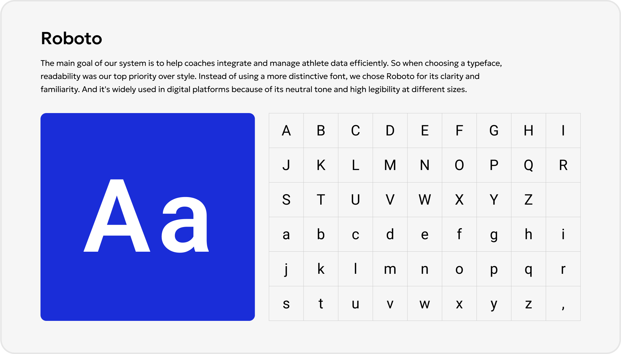
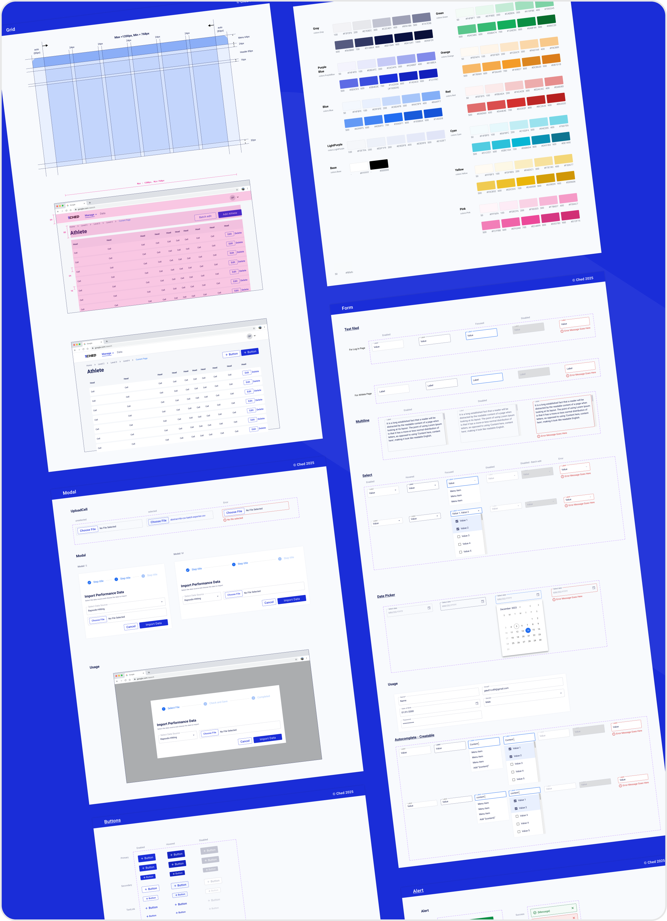
Since MUI ready-made components made it easier to ensure consistency across design and code, we build the UI components based on Material UI.

In our CHED project, visualizing athlete performance was a core feature. One of our team members took the lead in designing charts, and we shared those visuals with the client multiple times. The feedback was consistently positive, so we assumed we were on the right track.However, once development began, concerns surfaced. The dev team pointed out that some charts lacked clear value or purpose. This prompted us to revisit the designs and to our surprise, the client admitted that several of the charts weren’t useful or meaningful. That misalignment caused delays and rework.
As the design lead, I realized that this was more than just a miscommunication. It revealed a gap in our process: we didn’t have a clear decision-making framework to evaluate whether a visualization was necessary, valuable, or purposeful. I hadn’t challenged the assumptions behind each chart. I didn’t ask enough “Why this?”, “Who needs this?”, and “What will it help them do?” We responded by returning to the client with more targeted questions:
-What specific decisions will this chart support?
-Who will be using it, and when?
-Is there a more effective or simpler way to present this data?
That conversation changed everything. We removed charts that didn’t serve a clear purpose and refined others with real usage in mind. This helped us deliver a cleaner, more intentional experience and helped our dev team move forward with confidence. This experience reinforced a deeper lesson:
If I can’t explain the reason behind a design decision, it probably doesn’t belong.
In retrospect, I learned that even when the client is the user, we still need to frame our feedback sessions around real tasks and context not just surface-level impressions. Asking better questions earlier would have helped us avoid misaligned effort.