
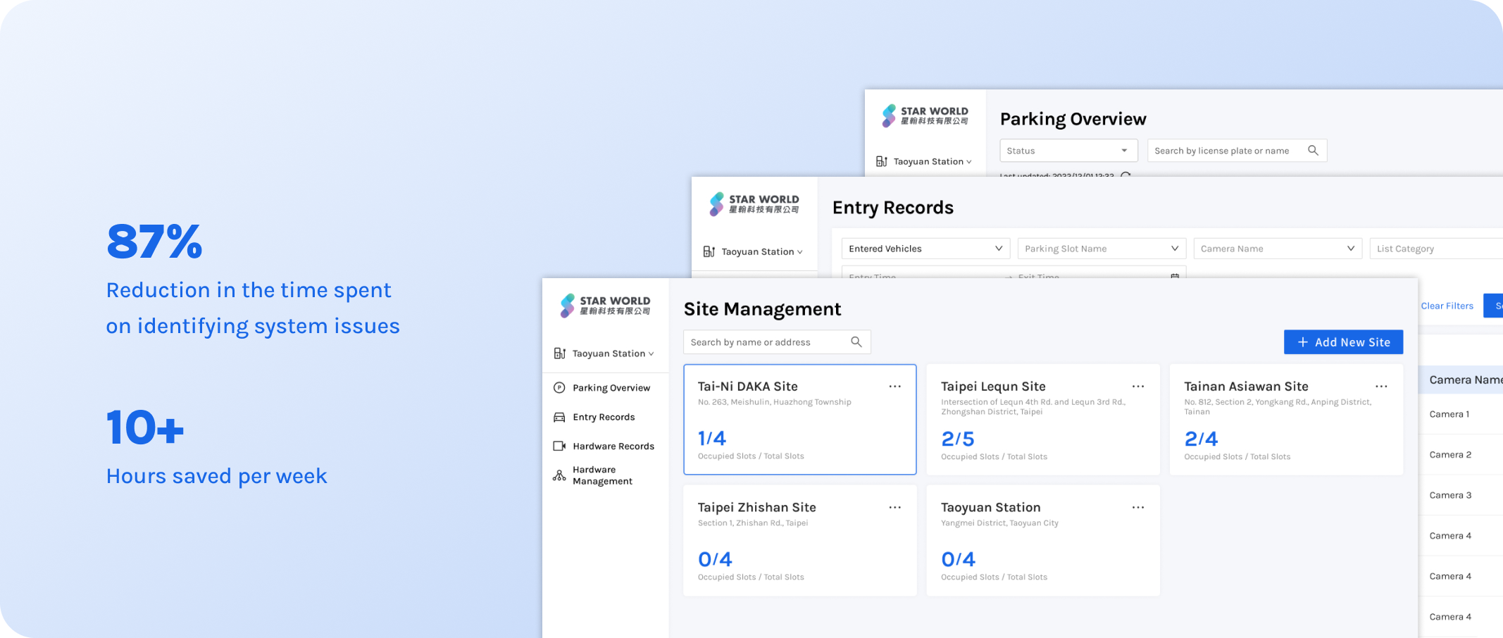
Before implementing the new system, maintenance teams spent 15 hours per week diagnosing and resolving 20+ issues. With the system, troubleshooting now takes only 6–8 minutes per issue, reducing the total time to 2–3 hours per week. This resulted in a 87% reduction in the time spent on identifying system issues, 10+ hours saved per week.
Our client has established smart EV parking lots, but the maintainers not able to monitor the real-time operation of hardware devices and vehicle movements. This led to challenges in diagnosing issues within parking lots and controlling hardware devices remotely. Thus, they asked us for assistance with IoT support.In our role as UX/UI designers, we collaborated with cross-functional team members to recreate a system that helped simplify the process of troubleshooting and bug fixing.
End Users' Challenges
1. Unable to grasp the status of hardware device within the parking lot
2. Identified the issues but cannot control the device remotely
Clients' Challenges
1. Low maintenance efficiency increases operational costs.
2. Lack of remote control requires on-site fixes, raising labor costs.
Before implementing the new system, maintenance teams spent 15 hours per week diagnosing and resolving 20+ issues. With the system, troubleshooting now takes only 6–8 minutes per issue, reducing the total time to 2–3 hours per week. This resulted in a 87% reduction in the time spent on identifying system issues, 10+ hours saved per week.
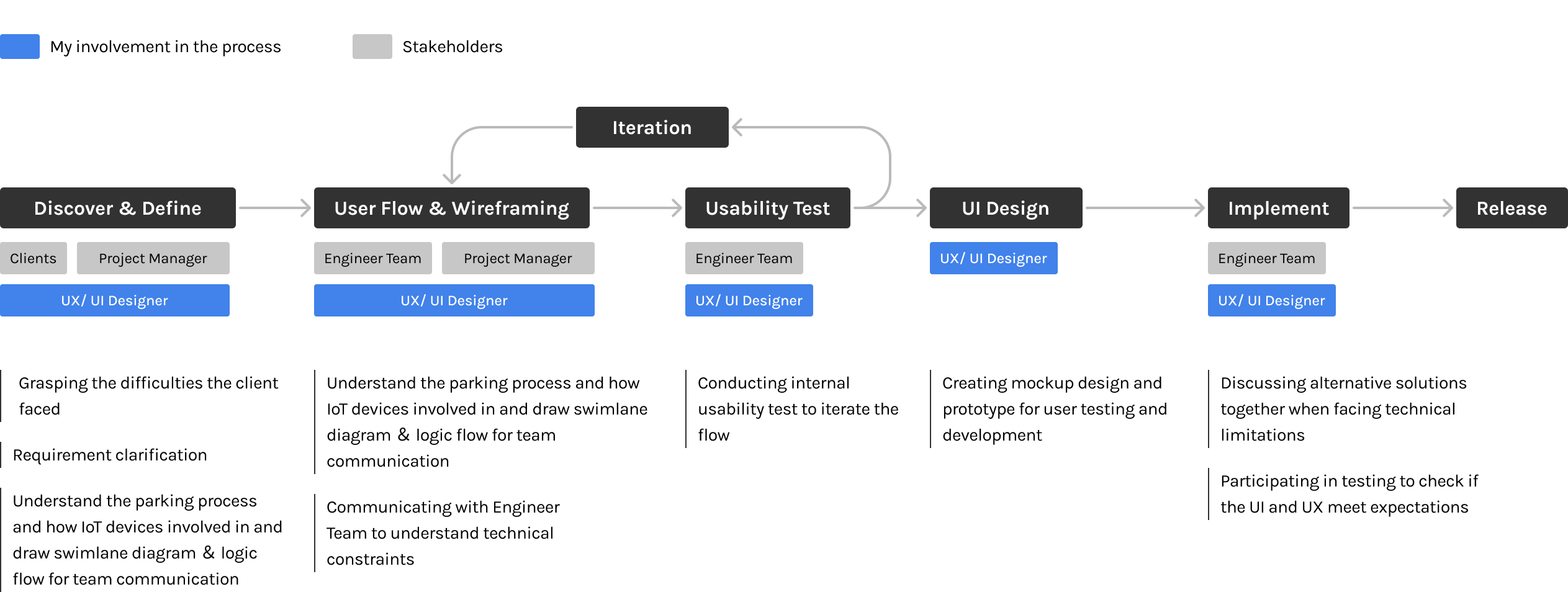
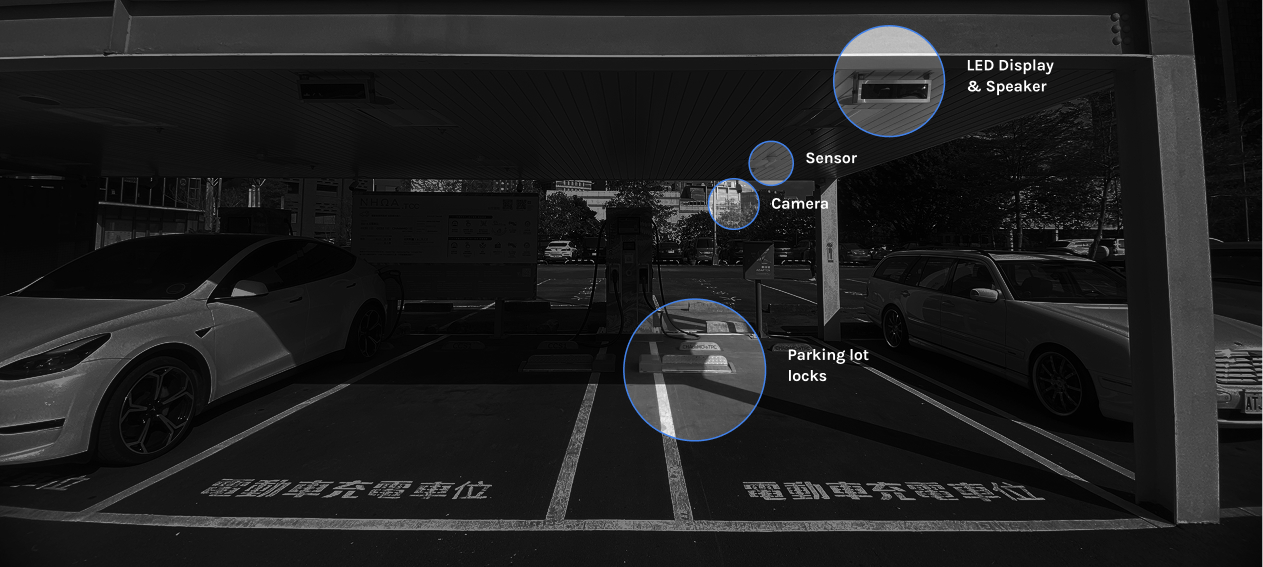
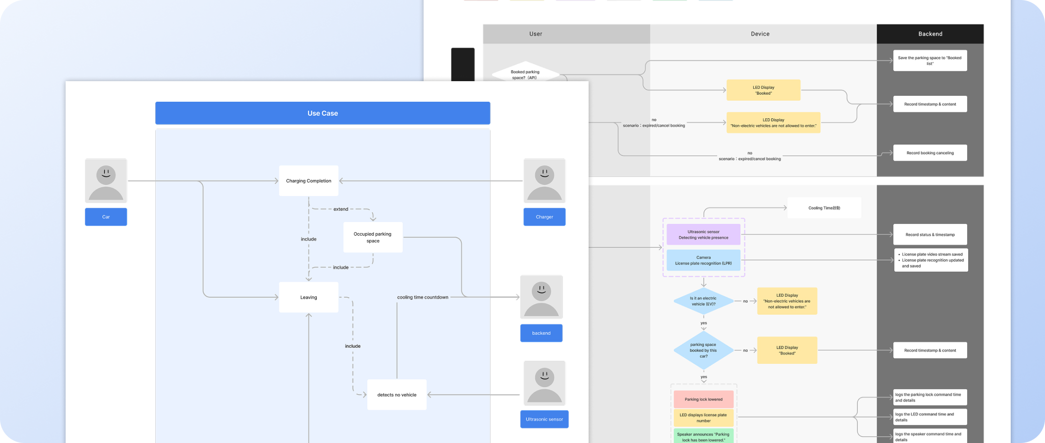
One of the key challenges in this project was the complex interaction between hardware devices and the software system. The parking lot relied on multiple IoT components, such as sensors, gates, and controllers, which often worked together in a sequence. When an issue occurred, it was difficult for the maintenance team to identify the root
improve team understanding, we created swimlane diagrams and use cases that visualizes the relationships between different components — devices, systems, and processes — that are directly tied to touchpoints in a job journey: how it starts and ends.
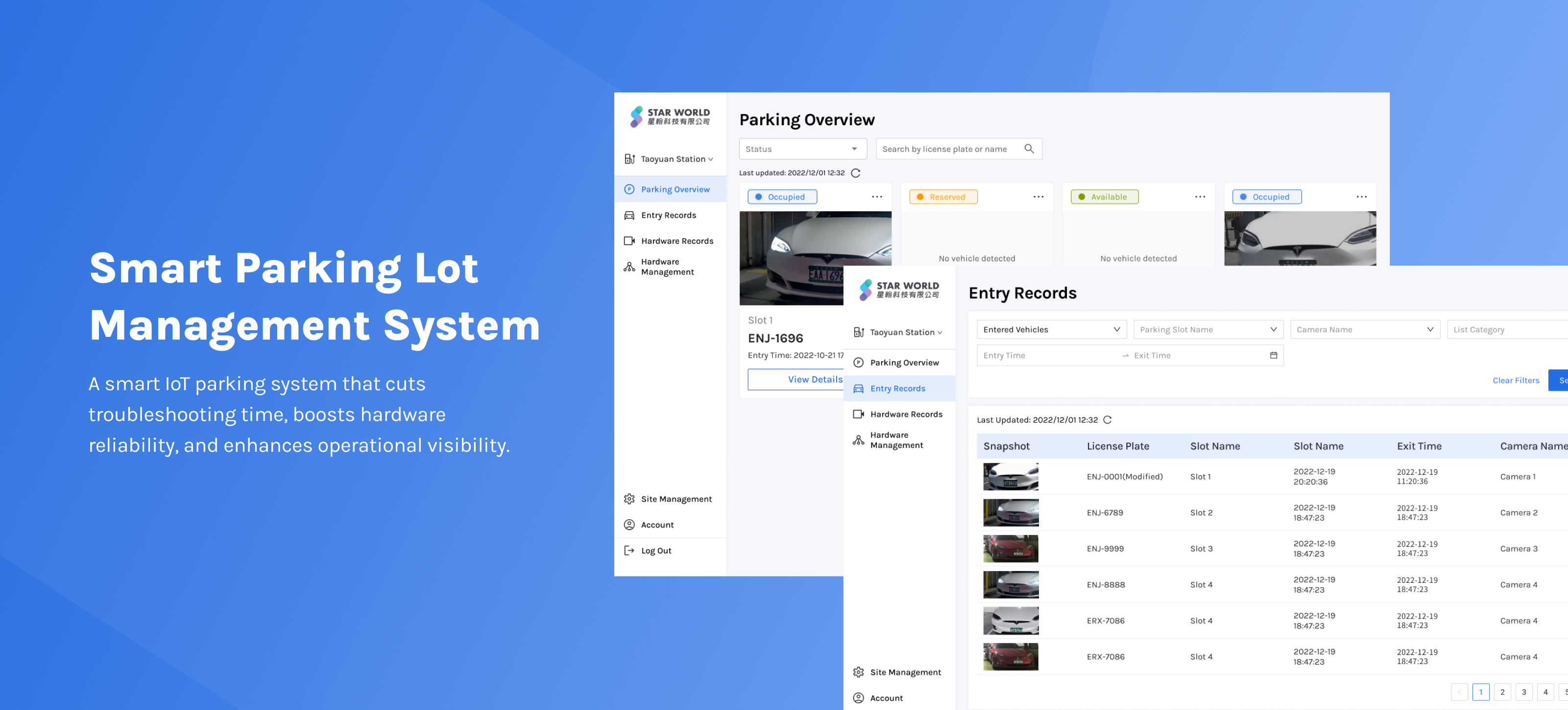
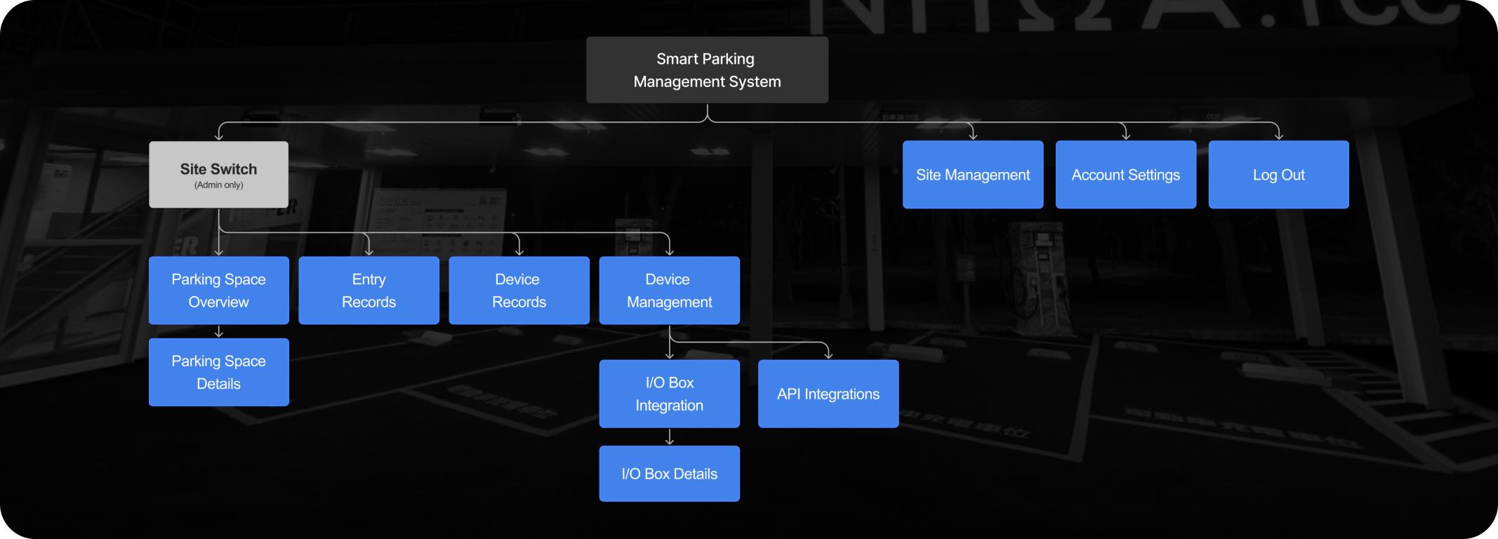
At the beginning of the project, the scope and requirements were unclear. This made it difficult for the team to decide what features to build and in what order. To address this, we created user flow and rough wireframes to communicate early ideas with clients and stakeholders. These visual drafts helped align expectations, define the core features, and narrow down the scope. It also supported the team in prioritizing tasks more effectively.
Carol, the other designer and I drafted the sitemap and wireframe to discuss with the clients and stakeholders.
After creating a clickable prototype, we conducted an internal user testing to get feedbacks and continue iterating product. We aimed to evaluate whether the following three design elements align with users’ intuition during their first-time experience with the system:
1. Whether users can quickly identify and locate vehicle-related information (including license plate, parking slot, and status)
2. Whether users can understand and correctly use the “Correct Plate Number” function when a recognition error occurs
3. Whether users can access and interpret the latest device statuses (e.g., ground lock, camera) to resolve issues with vehicle entry or exit
These three features are among the most frequently used in the system. The test outcomes is significant and insightful. We’ve learned 18 key takeaways, including 3 validated, 14 concerns, and 1 opportunities.
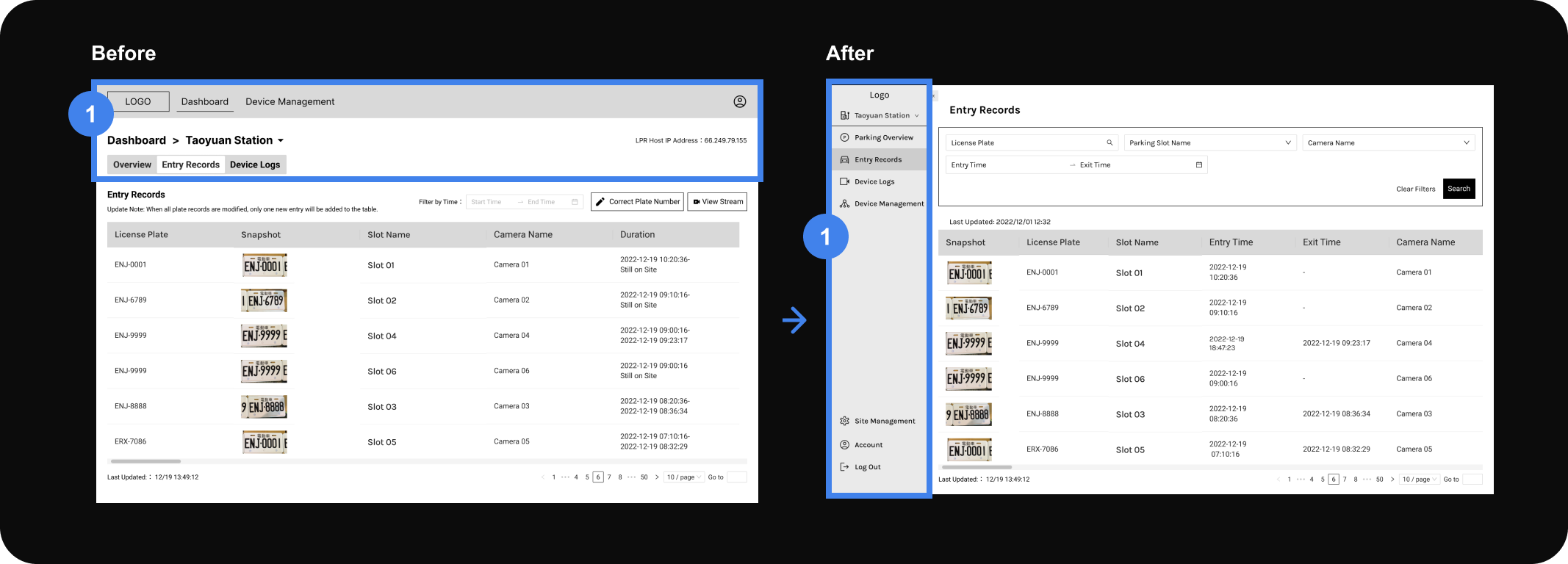
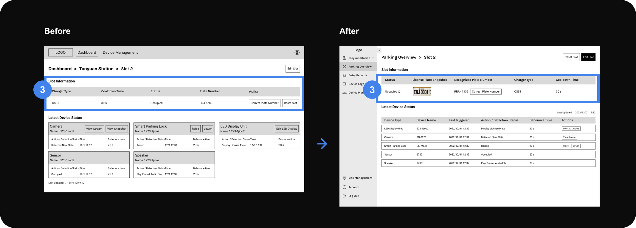
Problem 1 - Unclear Hierarchy and Unscalable Structure
Solution 1 - Switched to a Sidebar Layout
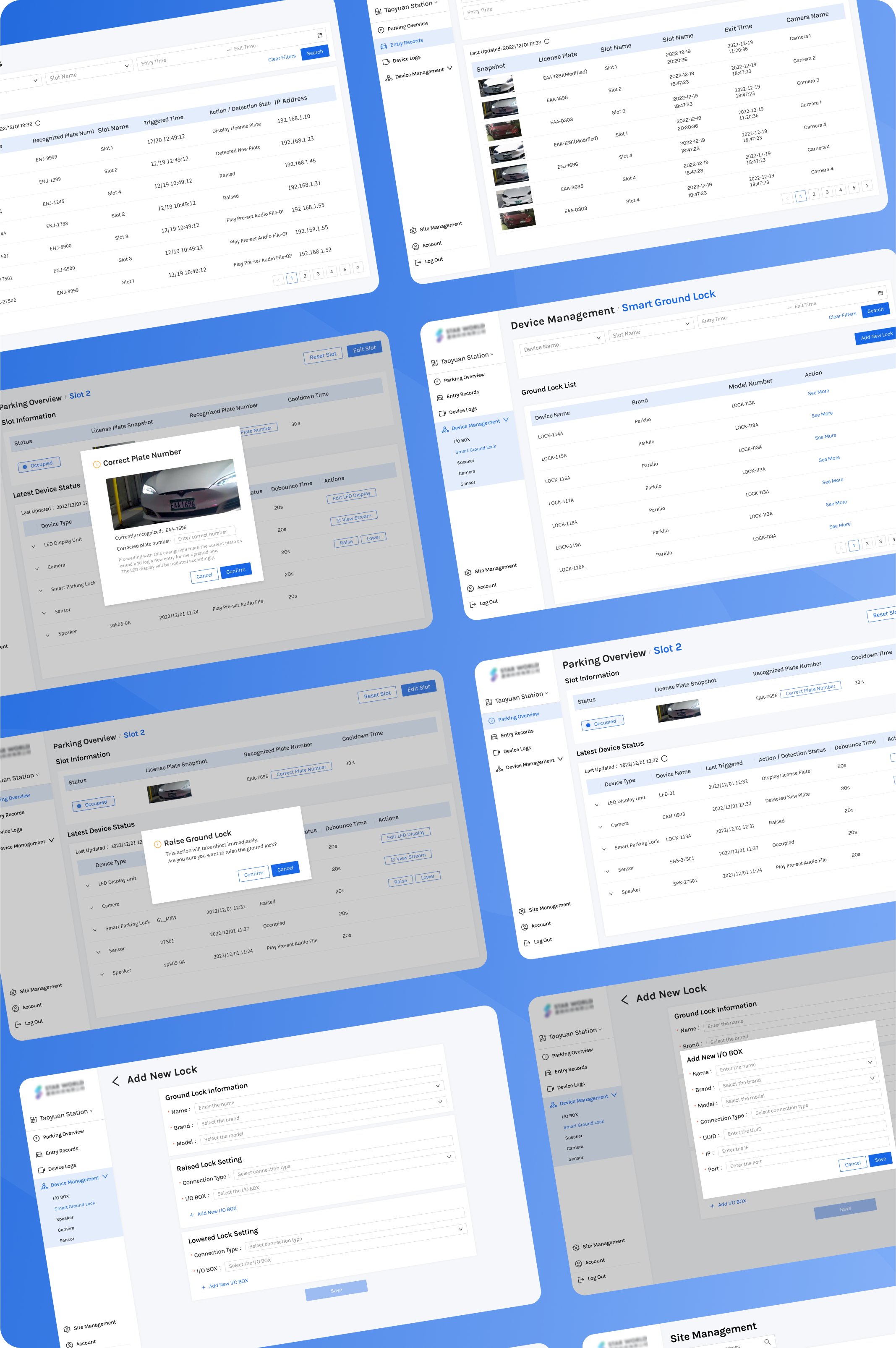
During internal testing, some participants unsure about the hierarchy and how different pages were related. As the system expanded and new modules such as Device Management were introduced, the header menu could no longer accommodate sub-categories. Thus, we changed the header to a sidebar menu, which provided a more scalable structure. By reducing the header height, we were able to display more rows in tables.
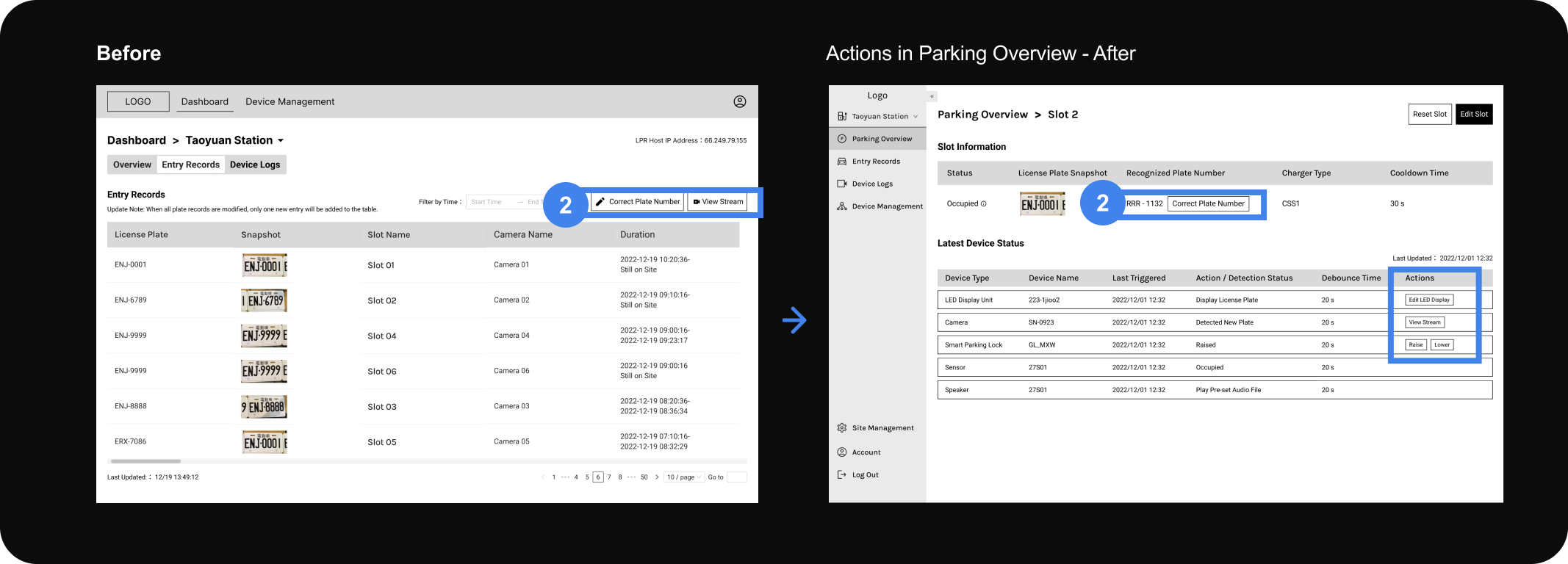
Problem 2 - Mismatch Between Page Title and User Expectations
Solution 2 - Moved Actions to the "Parking Overview" Page
Initially, the "Entry Records" page included both log viewing and action-based functions. However, users perceived this page as a log-only view and did not expect to do actions here (e.g., editing plates). To address these issues, we relocated all license plate-related actions (such as editing and viewing vehicle activity) to the "Parking Overview" page.
- Clearer semantics: The term "Overview" better suggests a place for managing and interacting with parking and license plate data.
- Improved mental model: Separating logs from actions helps reduce confusion and improves overall usability.
Problem 3 - Information not organized in a meaningful order
Solution 3 - Adjust information order and add snapshot for reference
According to the task, we notice the information can't help the user to do their task efficiently. For example, the charger type information and cooldown time are less helpful in most of the daily work, so we placed them in the last two. Also, a snapshot could be very helpful for user to confirm if the recognized plate number is not correctly recognized.
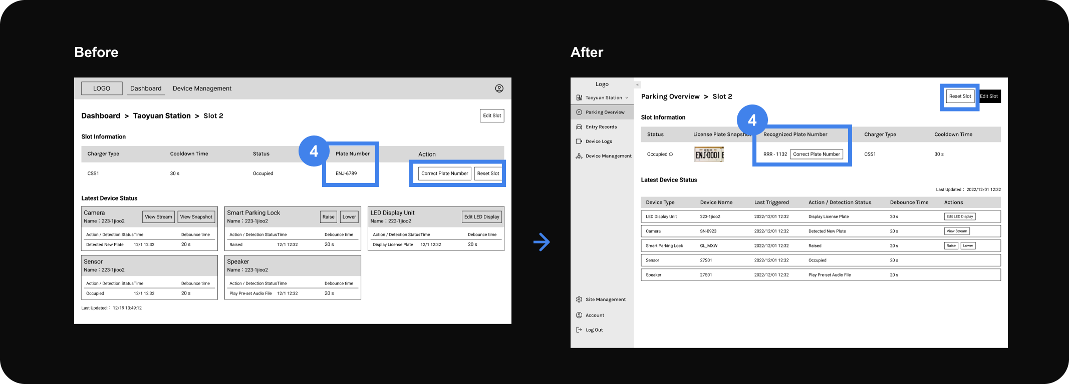
Problem 4 - Misleading Labeling
Solution 4 - Clearer Terminology & Placement
During testing, users didn’t realize the plate number was system-generated and editable. The action button was also placed too far away, making it unclear what it was for. We renamed the field to “Recognized Plate Number” and moved the “Correct Plate Number” button right next to it — improving clarity and making the action more intuitive.
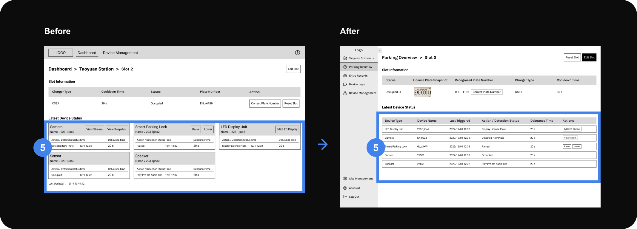
Problem 5 - Unclear hierarchy, hard to find information
Solution 5 - Redesigned the section into a structured table layout
In the original card layout, each hardware device had its own box. While this gave each unit its own space, users found it like “reading scattered news blocks, so we reduces repetitive labels and visual noise, which allows users to scan top to bottom or left to right more smoothly.
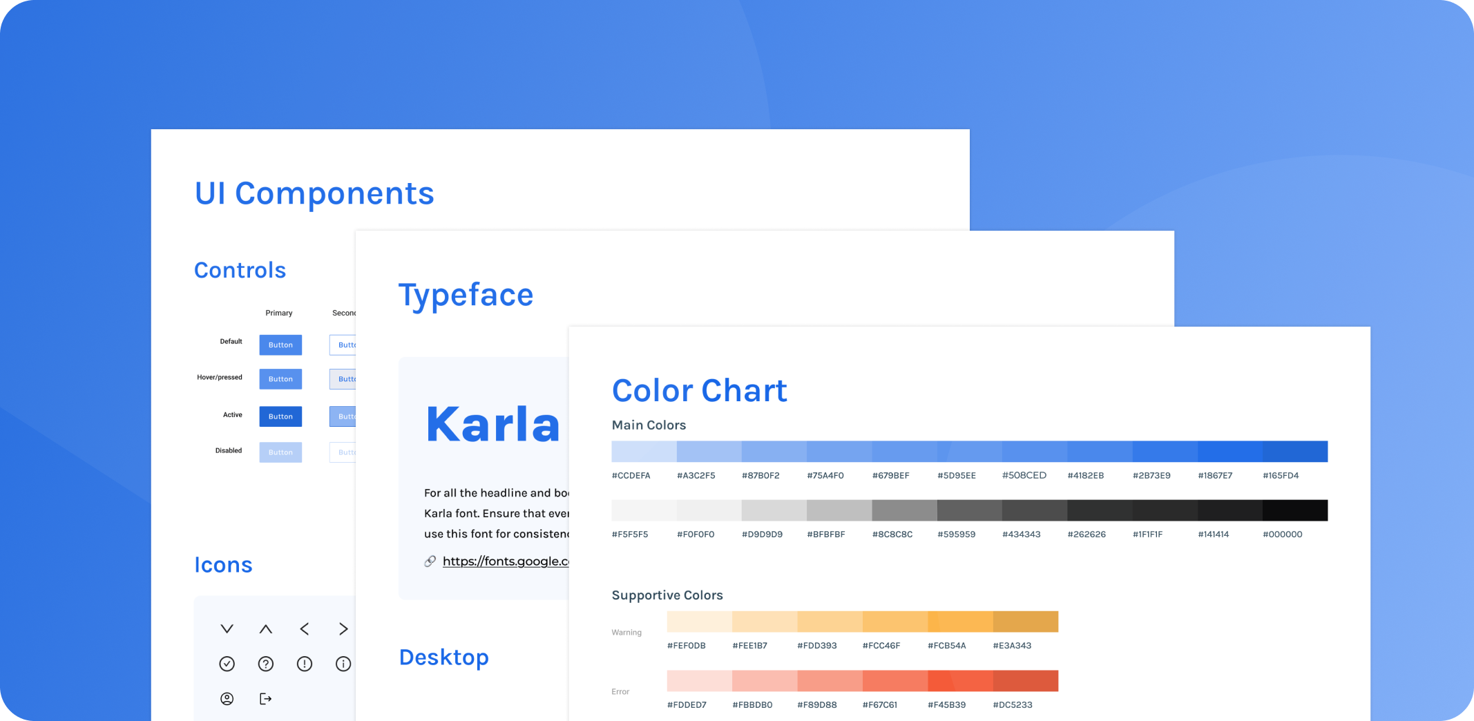
We followed the client’s brand colours and used Ant Design to build the UI components. Since the dev team used Vue, Ant’s ready-made components made it easier to ensure consistency across design and code.
The Parking Overview page displayed the latest few actions of each device (e.g., 5 latest records for the lock, speaker, etc.), assuming users needed to check recent activity by device type.However, through later usability testing with actual operators, we discovered that their debugging process follows a chronological flow, not a per-device view. They start by checking when the camera detected a plate, then step through each subsequent action to see whether the hardware responded as expected — in order of execution, not category.This insight revealed a mismatch between the interface structure and the real-world workflow.
As a result, rethinking how system activity is presented in a time-based sequence will be a key priority for the next iteration.